


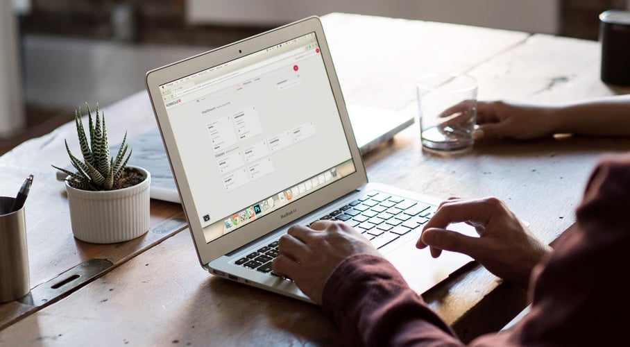
We had two goals when we started the konsoleH redesign: make it simple for our customers to get their work done, and make it easy to do so on multiple devices. The card-based design style of konsoleH 2 allows us to create an improved control panel that supports your on-the-go work. You’ll be able to execute your tasks and functions more effectively and with greater efficiency. Here’s why we chose card-based design.
Card-based design 101
At its simplest level, card-based design is a style that allows information to be divided into meaningful sections, with information prioritised for users in a simple and intuitive manner. This design is the choice of many successful, engaging companies - Google, Twitter, Pinterest, Facebook and Instagram all use card-based design. For Hetzner, one of the most appealing features is its responsiveness to whichever device you use. We no longer live in a world where we all sit behind computers all day. You need to be able to access and execute your tasks to support your online business from any device you choose. Card-based design enables us to do that for konsoleH 2.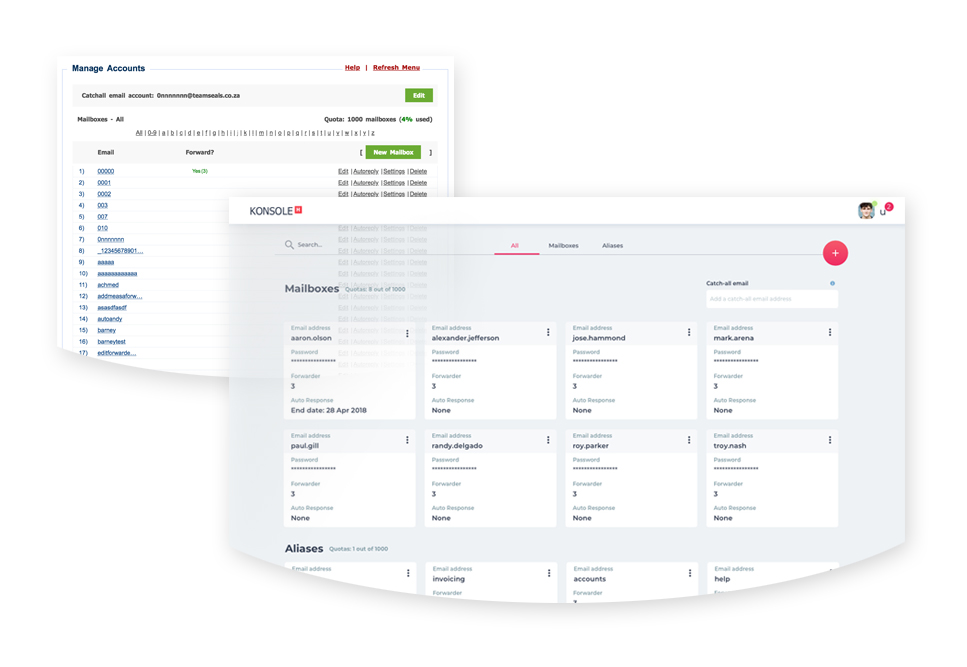
Learning from the best
Pinterest is the pioneer of card-based design and, along with Google and Instagram, has changed how we interact with content online. This is not just because card-based design is an attractive visual style that’s easy to scroll through. It also has three specific characteristics that we felt were necessary for the new konsoleH 2:
- Scannability -easy to read at a glance;
- Scalability and responsiveness - the design works well on any device you choose, so you can edit on the go;
- Enhanced user experience - simple and straightforward to manage your work.
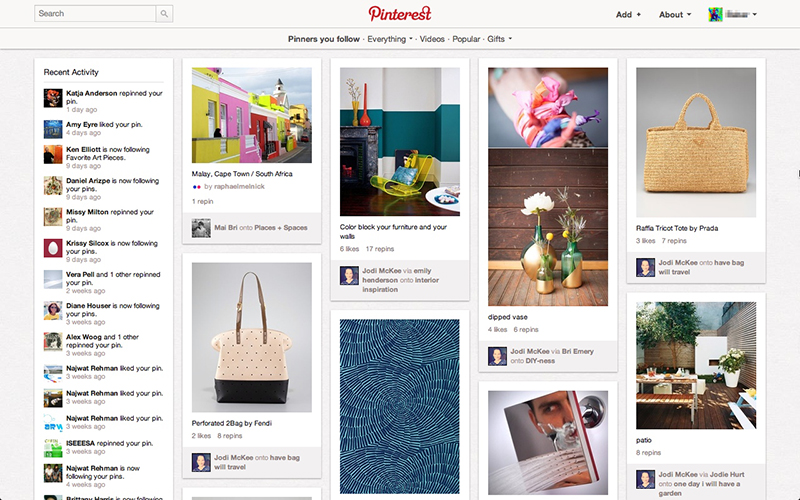 Image: A screengrab of one of the first Pinterest card-based designs
Credit: Babar Suleman (Crazyegg.com)
User participation in our design
Our customers have been part of the process of reimagining kH through user testing and feedback. The look, feel and functionality of card-based design plays a big part in the konsoleH 2 revamp. Here’s what our users are encouraging us to pursue along the journey:
- Simplicity We see the need for breaking down content into smaller blocks, and creating meaningful, categorised sections which help to focus your attention. The grid-like layout of card-based design offers the user a clear path to the data, administration, tasks, functionality or purchasing processes that they wish to access. In konsoleH 2, for example, this means that we’ve simplified the path to tasks such as assigning permissions to users or creating mailboxes and email aliases.
- Scalability and responsiveness Cards stack well on a mobile phone, tablet or desktop. Cards are scalable for and responsive to various devices and screen sizes, giving you flexibility to perform your tasks on the device that suits you.
- Adaptiveness One of the key characteristics of card-based design is its layout adaptiveness and consistency for you across all of your devices. This layout style also gives us the freedom to design our cards so that the content is easy to navigate, regardless of the volume or complexity of your tasks.
The road ahead
Through our iterative design process, we’ve begun the journey to a new and improved control panel. With each step, we take into account, among others, your insights, experiences and recommendations. Ever mindful of your experiences, both the positive and negative, we will continue to use these insights to create and evolve our control panel.
Sources: Medium, Medialoot, Intercom, Smashing Magazine, Aztek, UX Planet, Apiumtech

