


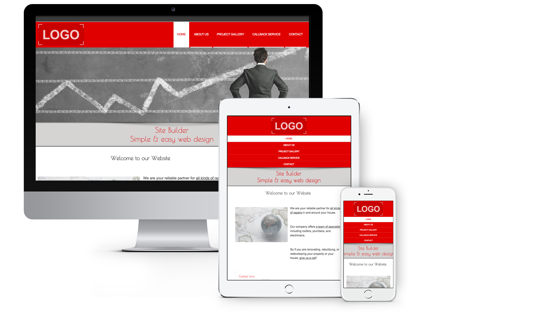 Our SiteBuilder now has exciting new responsive designs. This means your website is now able to resize to suit a range of devices from tablets to smartphones. Existing SiteBuilder customers will find it easy to switch to one of these responsive design templates. Find out how.
Our SiteBuilder also supports Google web fonts, giving customers more options to individually style their website content. In order to expand your font selection while editing your website content, you will need to switch to expert mode. Once done, you will see the editor toolbar appear as you type within the text area. This toolbar will give you the enhanced font selection.


