You’ve built your website. You’ve launched your online brand. Your e-commerce store is up and running. But why aren’t you making any money? The answer might lie in Conversion Rate Optimisation (CRO).
Moving your business online and setting up your e-commerce infrastructure is a huge step. With competitor research, planning and rethinking your entire way of managing your inventory is a massive undertaking. It stands to reason that you would expect to reap the benefits of all that hard work right away. The reality is that setting up an online store is only the beginning. Techniques like Conversion Rate Optimisation (CRO) involve constantly measuring and adapting your methods in order to improve how your website performs. It’s a marketing discipline that follows a user-centric approach to increase conversion.
If that all sounds daunting, don’t worry. We asked CRO specialist Brendan McNulty to share his most helpful tips to help you master the practice.
What is CRO?
Conversion rate optimisation is a process to increase the conversion on your website: to increase how many visitors turn into paying customers. It involves understanding how people use your website and then making a hypothesis about what can be done to improve it. This hypothesis is validated through A/B testing – a method where two variations of a page are shown to visitors. The results of this testing (whether A or B prove more popular) are used to determine which page should be shown.
What you’re trying to do is make the buying process easier for visitors, and as a result, increase the revenue you make from the people on your website.
Why should you care about CRO?
It’s hard work getting people to visit your website. Writing copy to get SEO traffic and optimising social channels is challenging. Paying for Google or Facebook to send people to your site is expensive. If you could get 10% or 20% more revenue out of each visitor, that would make a big difference to your bottom line.
How do you go about doing it?
The first step is to understand how people interact with your website. Once you know that, it’s time to develop your hypotheses and validate them through testing. If you don’t have a lot of traffic, it can be difficult to get to a statistically significant result on your A/B testing. If you have enough evidence, you can put your test live (although I wouldn’t recommend this course. I’ve run thousands of A/B tests and I’m often amazed at the results.)
Testing
Google Optimise is a free split testing tool that plugs into Google Analytics and is great for doing A/B tests. You will probably need a developer to help you set up your test. You can set up three goals for your test to measure against, and Google will tell you the statistical significance of your variation being the winner and achieving those goals. With smaller sites without huge amounts of traffic, there are a few things you could do to get to a quicker result:
- Aim for micro-conversions instead. Make your goal reaching the basket, not a sales conversion. More people are likely to reach the basket than convert, but it is a step towards conversion. If you had more people doing that, it would be a good result
- Accept a less than 95% statistical significance. With 95% significance, they’re saying they’d expect A or B to win 19 times out of 20. If you accept an 80% significance, for example, that means they’d expect A or B to win four times out of five. It takes a lot less time and less traffic to reach 80% significance, and on balance you should be happy with this result.
How do you understand where people are struggling?
If you look at the literature around conversion rate optimisation, many expensive tools are recommended. But there are also plenty of free resources that can get you started quickly, offering immediate insights. Two really helpful tools are Google Analytics and Hotjar. Also, don’t forget usability testing with customers and feedback from your customer service team.
Google Analytics
Google Analytics is a great tool, but it can be daunting for the first time user. For the purposes of this discussion, we’re going to look at two things:
- High exit/bounce rate pages
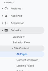
Go to Google Analytics, look down the right-hand side of the page and go to the menu Behaviour > Site content > All pages:

Look at the pages in this overview that have a high bounce and exit rate, and note them in a clue sheet (a spreadsheet with problem areas). - User journeys
Most sites have a default purchase journey that people will go through. For your average e-commerce site, the journey begins on the homepage. Visitors look through a category page to see the range of products, view a couple of product pages and then add products to their basket and checkout (ideally). Take a look at which pages people struggle with and where you find the largest drop-off. It tends to be the product page or the basket page. These are areas you’ll want to note in your clue sheet and focus on.
Hotjar
Hotjar is a great tool with a free tier which allows you to get some feedback. There are two things to look at:
- Heat maps
These can be set up on specific pages on your site – for example, the pages that you saw in Google Analytics that people were struggling with. A heatmap shows where people click on a page, and a scroll map shows how far they scroll down the page. Once you have some data, you can understand whether visitors are clicking on the page – does it map where you’d want or expect them to be clicking? You can also map whether they’re scrolling far enough to see the important content on the page, or if you should change the hierarchy of information. - User videos
You can set up user videos on certain, challenging pages. User videos are recordings of how people use your website. Look at where it seems people have indecision or are struggling. These are potential areas of friction on your site.
Usability testing
An easy way to do usability testing is to get someone who isn’t familiar with your site and ask them to perform the usual activity (for example, purchase a product). They need to talk out loud about what they’re thinking and you’re not allowed to help them or provide any prompting (this is sometimes very difficult!) As they go through the process, note the areas that they struggle with and clarify why they’re having an issue (ask questions like, “What would you expect to happen there?”)
Customer service feedback
Speak to your customer service people or note the themes that consistently come up in pre-sales communication with customers. What does everyone have questions about? What do people always have a problem with? These are potential areas for testing.
Understanding themes
By this stage, you should have a list of problem areas of your site on your clue sheet. For example, if you have a product page where:
- Everyone is clicking on images
- Customer service emails are asking for larger pictures, and
- During usability testing, someone commented, “I can’t see this enough”
A hypothesis could be that by increasing product image sizes, you’ll increase conversion. An A/B test will prove or disprove your hypothesis. You can prioritise changes by the amount of evidence that points to this issue and the importance of the page.
CRO can be a really useful tool to help you understand how your audience uses your site, make hypotheses about what their challenges are, and validate this through testing. Happy testing!
Want to read more on this subject? We recommend Digital marketing tactics every entrepreneur can master today.
About Brendan McNulty
Brendan is a conversion rate optimisation consultant blogging about tactics and strategies at brendanmcnulty.com. He is also the founder of diylegal.co.za which provides fixed price online legal services.


